This article was originally published in 2010. I’ve updated it somewhat and re-published.
Mood boards are a great way for a designer to get their client actively involved in the process early-on in a web project. This allows the client to feel that they are being included and kept in the loop. And it gives them a way to participate in the design process.
I am a fairly linear person, (especially considering that I’m a designer). When I first started designing, I would want to jump in on a new design project, open Photoshop and bang out the design template straight away. I had a pretty good idea up front what would work in HTML/CSS and what wouldn’t, so I usually felt confident that I could come up with a good, usable design on the first couple of attempts. This approach worked well for me for the most part, for several years.
There was always that inevitable moment however, when I was finished with the draft of the template and ready to post it for the client. I would invariably think to myself, “What if they don’t like it? What if it’s not what they had in mind? Will I have to re-do this whole thing from scratch? Should I defend it? (I am the designer after all.)” At this point, I was already far enough along in the prototyping process that starting over would have been difficult.
I realize now that by keeping the client out of the process between the initial meeting and the reveal of the first comp, I was really doing both of us a disservice. The client potentially felt left out at this point and if the design was a departure from their initial vision, it could shake their confidence in me as a designer. It also meant that I was ignoring some potentially great creative input from the client.
I have always tried, in the early stages of a project, to get as much input as I can from the client about the look and feel of a project, asking about other sites that they like or don’t like, talking about colors, logos, etc. But I’ve come to realize that most clients don’t have a clear vision of what they want from the beginning. It’s all too common to spend hours on a finished Photoshop comp only to have the client realize that it’s not what they want (even though they may not have known what they wanted in the beginning).
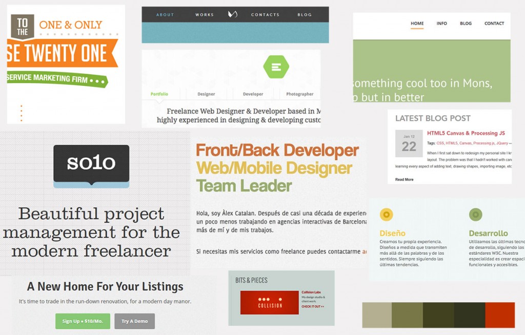
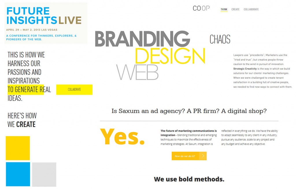
A mood board is a quickly thrown together collage of photos, colors, typography elements, scraps torn from magazines, etc. that together, give an overall feel for the visual direction of a design.
Mood boards accomplish several things all at once:
- They are a useful tool for the designer to very quickly put down visual ideas for the design.
- They separate the overall “mood” of the design from the interface elements and content. This effectively removes potential distractions for the client at this early stage.
- They allow the client to give creative input very early in the process, thereby avoiding back-tracking after the design comps are viewed.
- Mood boards speed up the visual prototyping process because the style has already been established.
I will definitely be including mood boards in my methodology for all future design projects.


So far, the only website of yours I have seen is mine. All this mood talk goes right past me. When I was an architect I could BS the client only so long before I had to show him a design. I think your website needs some links to your actual work.
Just a suggestion.
Thanks for your comments, Skip. There’s a link in the menu bar at the top that links to my portfolio. Or, you can click here.
no skip, back of the line!
This is a starting point, not a design presentation. duh
Pingback: Web design process | Blue Hat Design